Monday, 2 February 2015
It's Warhol actually...as in holes
By the '70s, Warhol no longer relied on secondary imagery and had expanded his range of subjects. He often took his own photographs and the ‘hand-made’ look became increasingly evident by additions of collage elements using torn papers, which were produced in a seemingly endless array of colours. The series of screen prints of Mick Jagger manifest this change in style.
Warhol met Jagger in 1963 when the band the Rolling Stones were not well known in the US. Warhol had designed the band’s provocative album cover Sticky Fingers. The album and the design proved to be a huge success. Warhol turned to the subject of Mick Jagger, now a celebrity friend and part of the New York club scene to explore in his art.
Bowie in Biro
David Bowie is an idol, in many ways and in many aspects of my life. Whether it be his music, his style, what he represents in history. On one particular day I came across this image of him and thought it would be a good one to use to practice drawing in Biro- rather than just black Biro ,which i have previously used at GCSE and AS, I decided to use black, blue, and red to add a different dimension to the image.
And in true punk style, I experimented with the photocopier to see what the image looked like in different colours. Taking the peachy tones from the original image I thought orange would compliment the drawing well and fit in with the 'vibe' I was hoping to achieve.
I then worked from real life. Using my boyfriend Ben as a model I began an observational drawing in the style of the first Biro
drawing then worked into it further later on. and additionally used the photocopier to see what the outcome would be changing the colour settings. I really like how using two colours came out, again it reminded me very much of Warhol's iconic pop art screen prints.Reflection
Reflection is 1) the throwing back by a body or surface of light, heat, or sound without absorbing it, 2) serious thought or consideration. When presented with the second definition I was inspired to 'seriously think or consider' what reflections means to me as an individual and the term 'introspection' cropped up a few times in conversations with teachers, other pupils and anyone i spoke to about the title 'reflection'
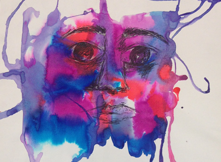
As a starting point I decided to create a graphite drawing from an imagine of a friend. The facial expression suggests a thoughtfulness and introspection. With this in mind I decided to mix the harsh graphite drawings with text; just a simple definition of 'intropection'.
I then photocopied this drawing and put stuck it over an almost galactic looking background. This was the start of my mixing black and white images with bold colour, and combining text; a formula I have developed throughout my project.
While still in the process of initial experimentation I decided to take a leaf out of the sex pistols book and play around with the photocopier. By changing the colour setting on the machine I created different brightly coloured version of this drawing and the outcome was a Warhol-like print.
Subscribe to:
Posts (Atom)